The Period Purse

Brand Identity Redesign

The Period Purse is a charity organization that provides hygiene products for homeless menstruators. The rebrand strives to establish a stronger brand and improve the organization's digital and physical presence. It provides a professional yet welcoming identity to inspire trust with fellow members of the community.

tools used

Illustrator, InDesign, Photoshop

problem

The Period Purse, like many charities, rely on donations and community effort to thrive. If the organization is not deemed as professional or trustworthy, people will not feel comfortable donating to them.

How can The Period Purse be rebranded to establish a reliable yet empathetic identity for both recipients and potential donators?

research

I researched the organization to understand their core message, identified areas for improvement in their existing logo and performed a competitive analysis of similar organizations.

goals

  • Simplify the existing logo for application across multiple mediums
  • Establish a clearer identity that reflects the charity's values
  • Develop a distinguishing brand for donators and recipients
  • Subtly communicate the organization’s work to maintain the recipient's dignity

Designing a cohesive and polished brand identity that maintains the warm vision of the charity while improving the stigma around menstruation. Give the impression of a friendly, trustworthy, and responsible charity organization.

process

The design process began with defining the brand’s goals and values. After generating a moodboard, an extensive number of purse icons and shapes were explored. I focused on refining the concepts behind the original logo.

The keywords garnered from the charity were dignity and kind. I focused on items that are considered representative of women in mainstream media as a form 'feminine' dignity; things that make people feel 'pretty' or 'beautiful'. I referred to actual purse stores as well. Kindness showed softer tones and smaller happiness.

The purse concept is what really differentiates this charity from other charities for the homeless. Thus, it was important to highlight the purse within the logo. A variety of shapes and abstractions of purses were explored. The circular form or period is a recurring theme to represent their mission of providing female hygiene products.

Iconography would denote all the different items that are accepted by the charity. I experimented with different styles for use throughout their website and other printed mediums that will match the logo for a connected identity. The icons also served as background patterns.

brand

Rationale

The proposed rebrand balances strong typography with a feminine touch. It demonstrates the charity’s goal to promote the importance of menstrual educatio, while also understanding that the topic can be a delicate manner.

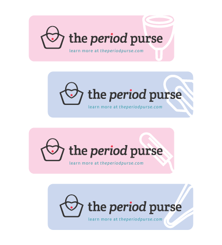
The singular red dot was retained from the original logo. It was placed on the tittle or ‘i’ as a natural and subtler alternative while maintaining it‘s impact as wordplay.

The word period is italicized to highlight it’s importance and soften the texture of the slab serif.

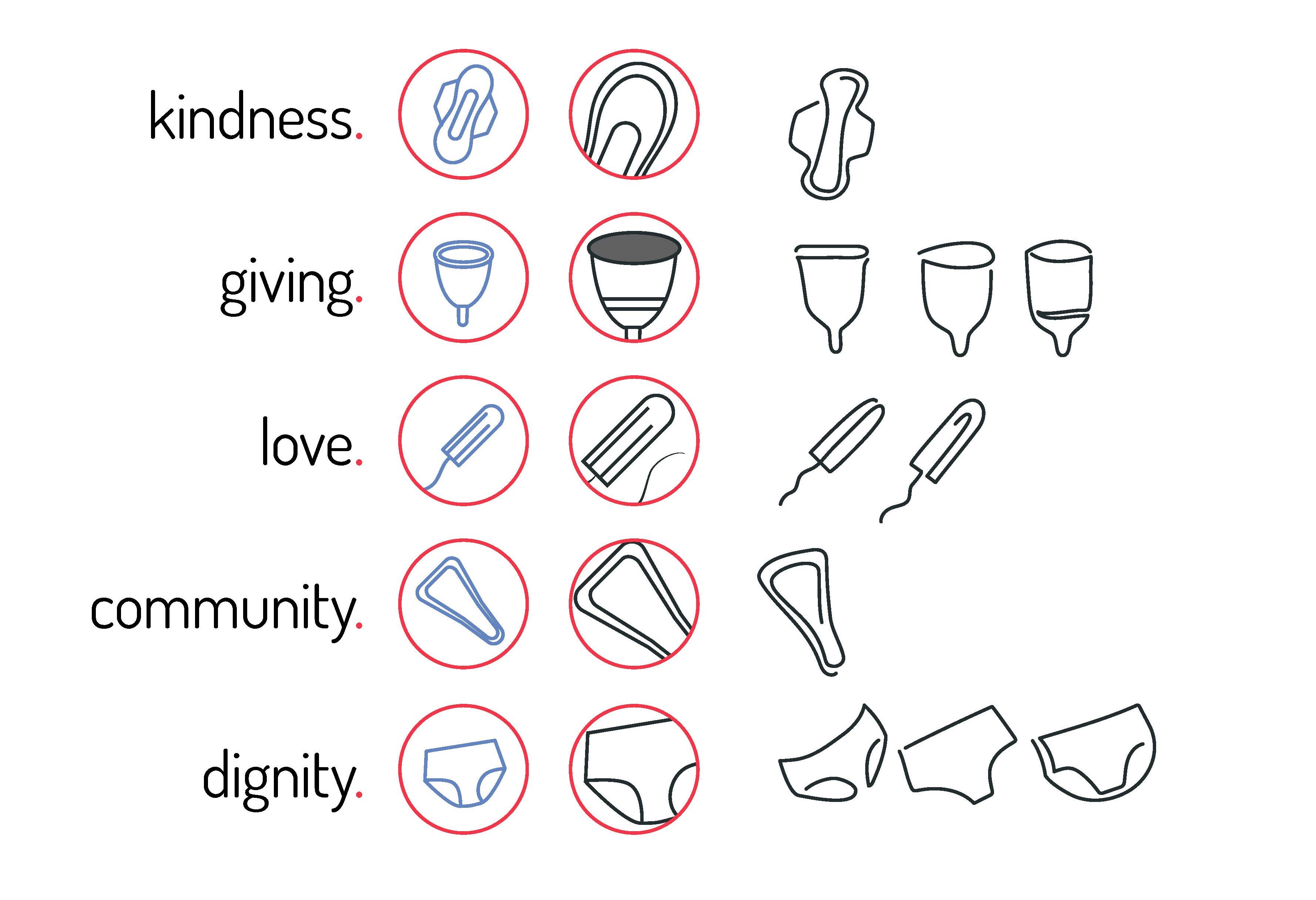
After experimenting with different shapes for the icon, a wider purse was chosen with a heart-shaped flap. The wideness represents abundance and the shape resembles the types of purses distributed.

The juxtaposition between strong and soft is extended to the brand colors which offset the bold blood red and charcoal on pastel pink and sky blue backgrounds.

mood

  • dignified
  • kind
  • meaningful
  • strong

colours

  • Primary
  • #333333
  • #F43649
  • Secondary
  • #319aa1
  • #666666
  • Tertiary
  • #FED4E7
  • #C9D7F8

typography

Purse Typography

Deliveries

A 24-page style guide that outlines the proposed goals, variations and various applications of the rebrand, including a mockup of their website.