HANI Packaging
Package Design
HANI is a cute, simple yet multi-functional reusable and recyclable earphone package.
tools used
Illustrator, Laser Cutting, Sewing
awards
2019 Applied Arts Award for Single Packaging
Package Design
HANI is a cute, simple yet multi-functional reusable and recyclable earphone package.
tools used
Illustrator, Laser Cutting, Sewing
awards
2019 Applied Arts Award for Single Packaging
With every pair of earphones, a bulky plastic package is discarded. Additionally, wired earphones often do not come with their own case, resulting in tangled wires and dirty earbuds.
How can we sustainably improve earphone packaging?
Much of the existing packaging consists of wasteful clear, vacuum sealed, plastic boxes with a carton insert. Once opened, almost 99% of the materials are simply thrown out. Some even use non-recyclable plastics. Also, it is rare for these wired earphones to come with a means of organizing them or keeping the buds protected. Note, it is important that the packaging accommodates different ways of being displayed.
A pair of earphones were given to random users that fit the demographic with instructions to store the earphones away. 80% of participants wound the wires around their hand; the remaining simply stuffed the earphones into their bags. When asked about their grievances towards storing earphones, all replied that tangled wires and dirty earbuds were the most annoying matters.
Design earphone packaging that has a secondary function, encouraging consumers to reuse the packaging and reduce waste.
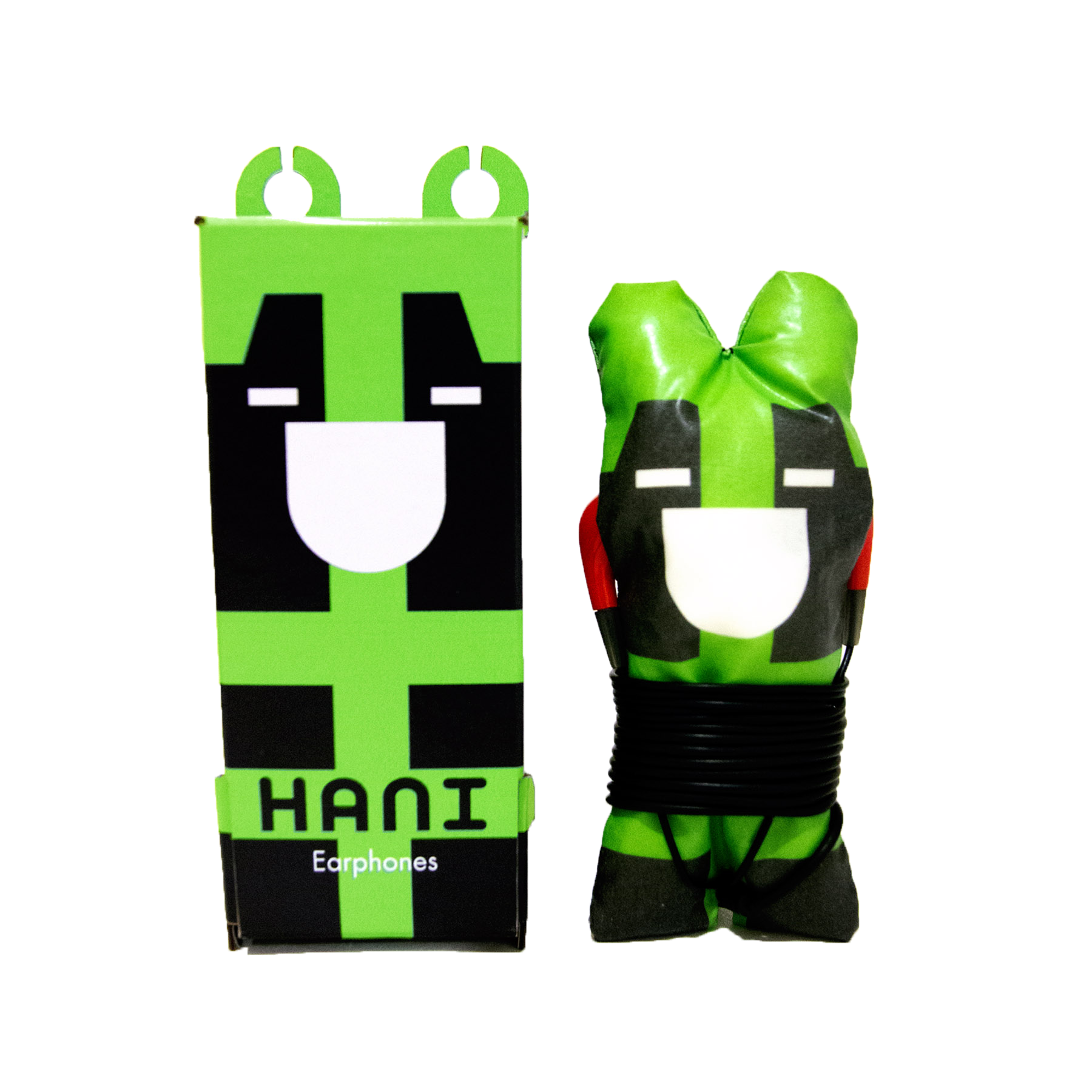
The plushie and the box concept.
A plushie to protect the earphones and a box that is fully recyclable and reusable.
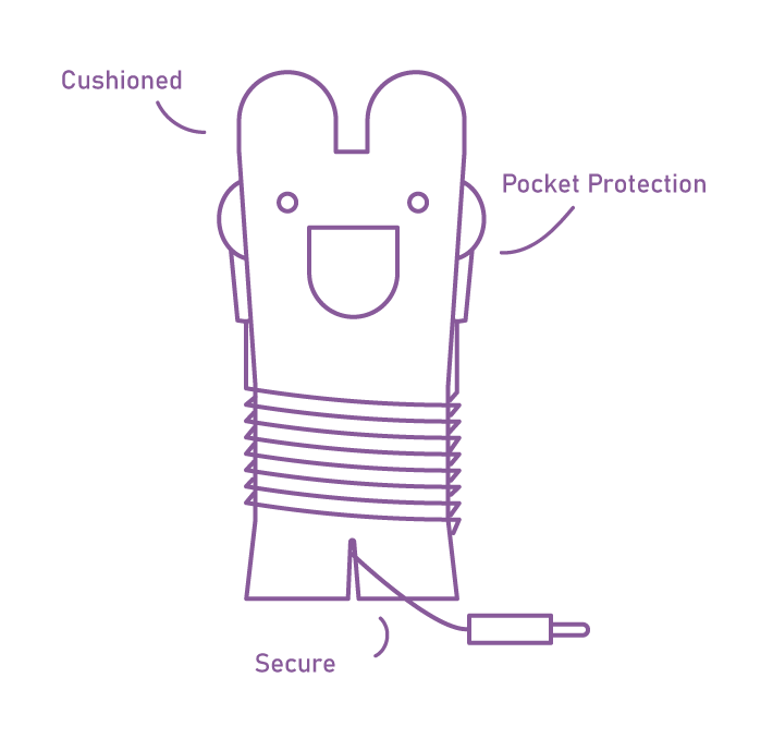
Earphones come wrapped around the plushie; the buds are tucked into pockets on the side and the plug is slotted at the bottom. This protects the earbuds, keeps them clean, and prevents the wires from unraveling or getting tangled.
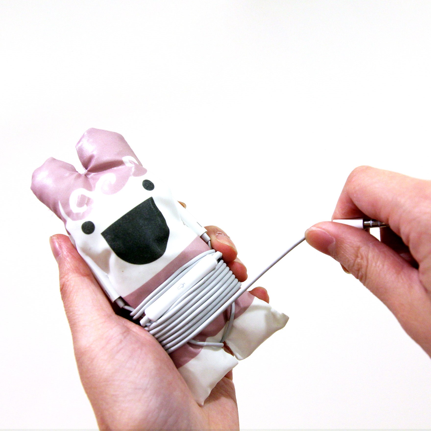
Simply wrap your earphones around the cute plushies and throw them into your bags! The material has a wax-like film which mean it’s sturdier and water resistant; the plushie can be easily wiped down. The bottom slot is angled so that the cable does not unwind on it’s own.
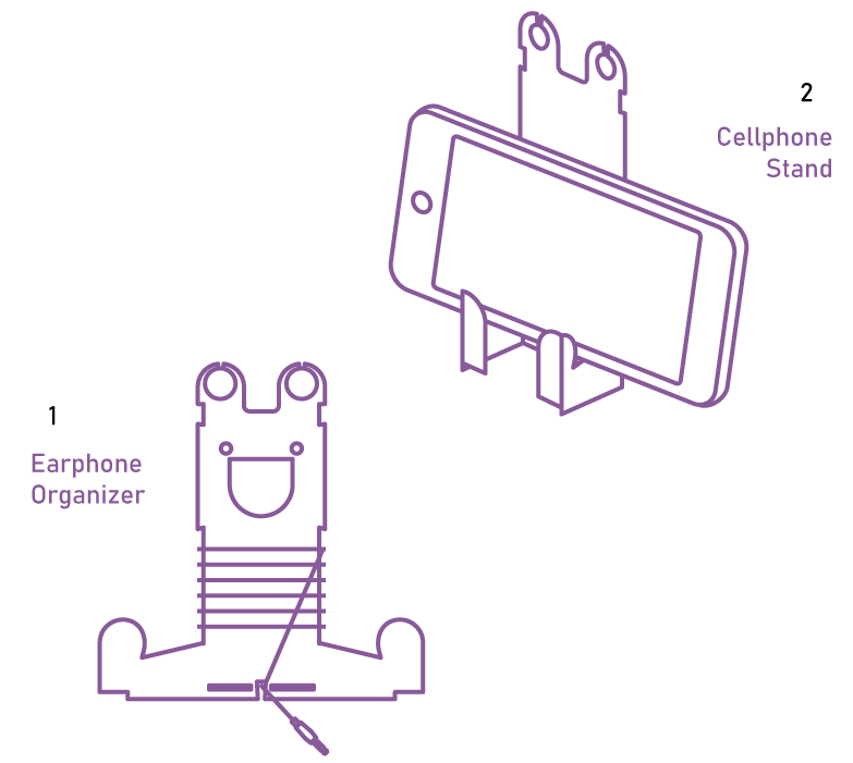
Part of box transforms into a cute stand that is also an earphone organizer and a cellphone stand!
The ‘ears’ double as an earbud holder and as a means of hanging the package for display.
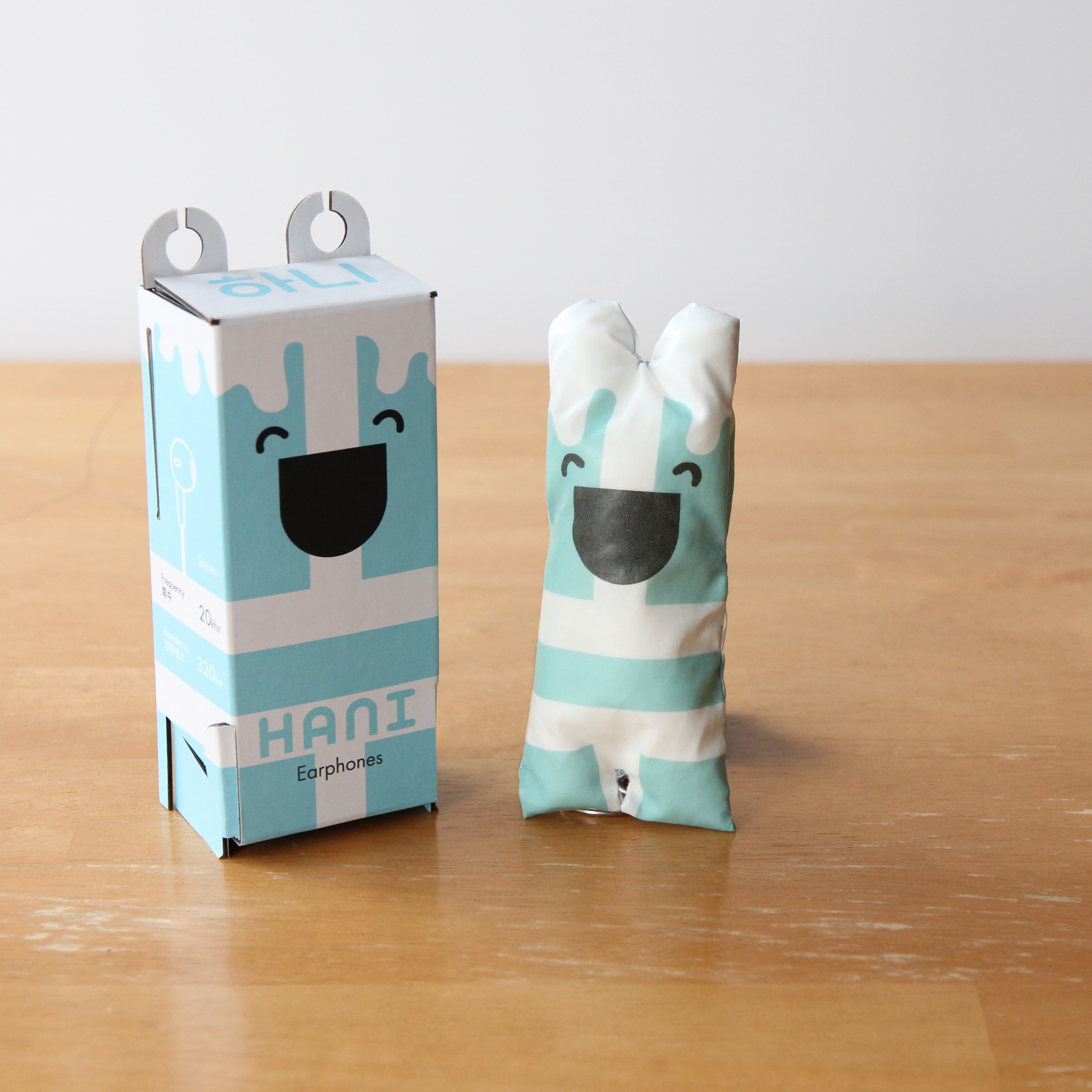
The plushie substitutes the emptiness of typical earphone packaging with padding. The box adds a second layer of protection and security so that the earphones are not damaged during transportation.
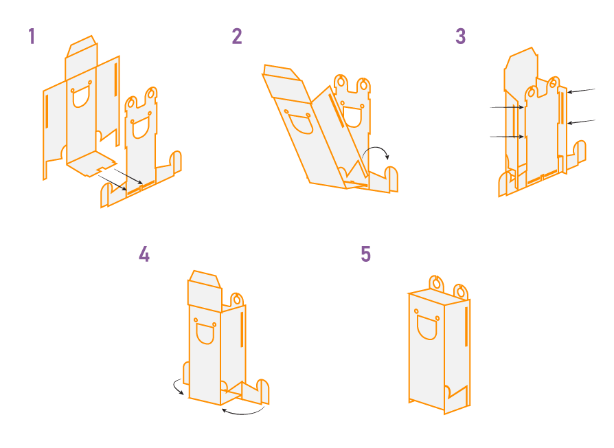
Without a single drop of glue, the box is designed with two interlocking pieces that can be easily assembled and disassembled. This also means the package is thin enough to fit into your pocket!
.gif)
The target audience are between the ages of 6-20 years old. The product is easily affordable wired earphones that are often sold in stores. Thus, the focus of HANI is to be fun and cute. The logo and brand features a wide smile, signifying the enjoyment users get from listening to music.
I was challenged to make this packaging bi-lingual and chose Korean because I love listening to Korean pop music. HANI is a play on the words Han (from the name of South Korea, Han-guk) and ‘ear’ meaning HANI is the Korean Ear. The sans-serif font mimics the geometric shapes used to design the characters.
mood
colours
typography
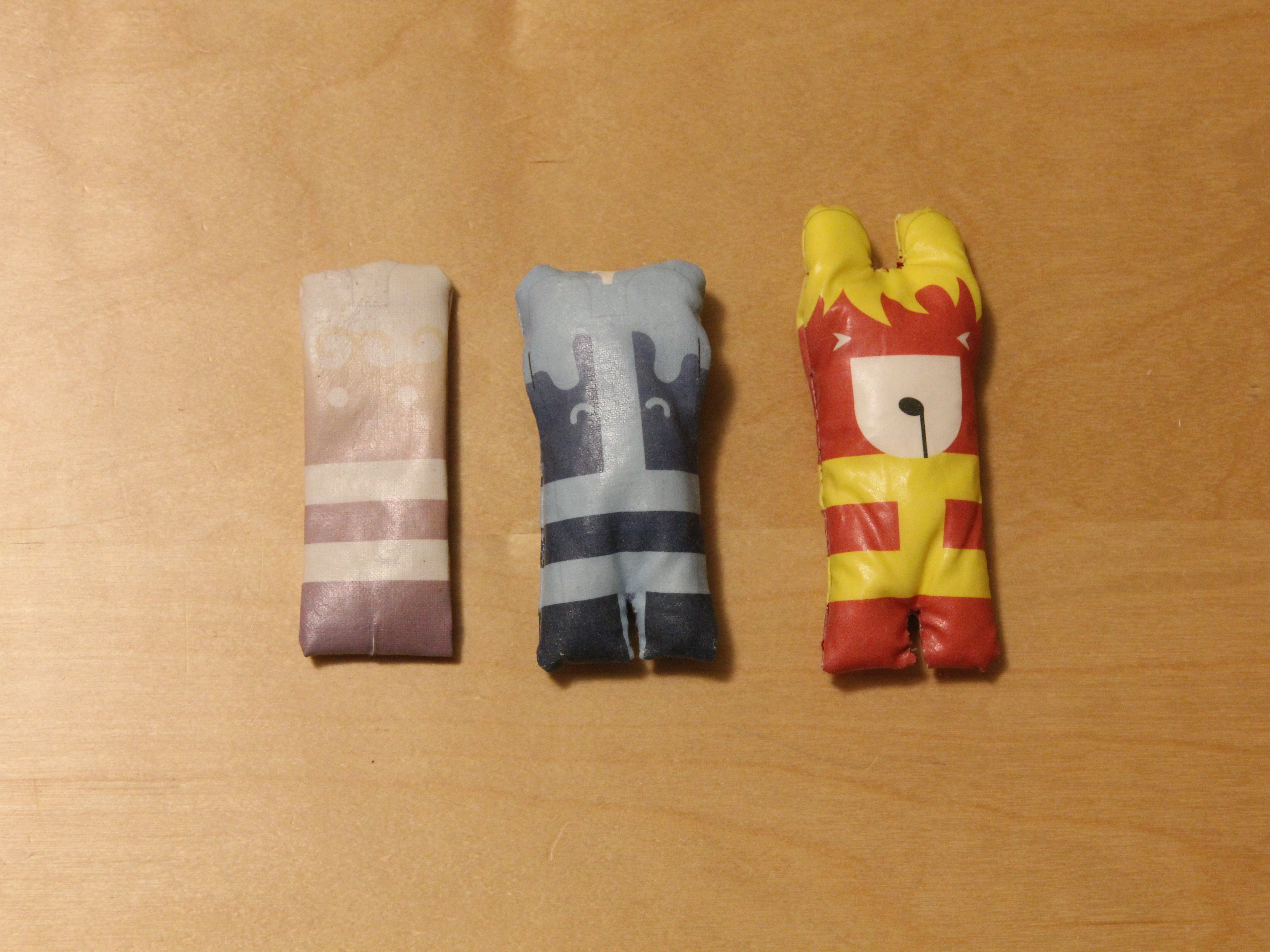
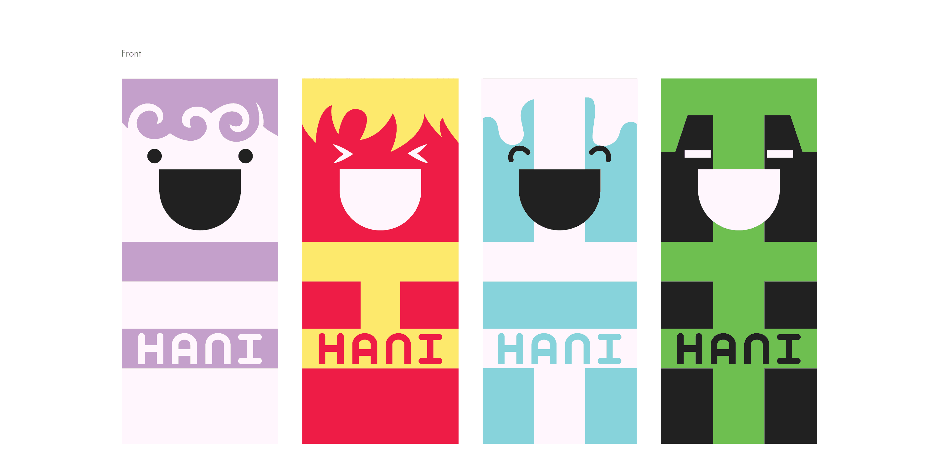
HANI has bright, colourful and simple cartoon creatures that would cater to a younger audience. They’re inspired by the Korean trigrams, representing air, fire, water & earth, and given names similar to the Korean pronounciation. The eyes on each creature imitate the shape of each element and give the packaging a sense of personality.
This concept can be easily customized into other character designs (i.e. sports players, celebrities, or other fictional characters).
The design process spanned 6 months and included an extensive number of digital mock ups, physical prototypes and even font exploration. The process was documented in a 36-pg book. Featured here are snippets of the work.
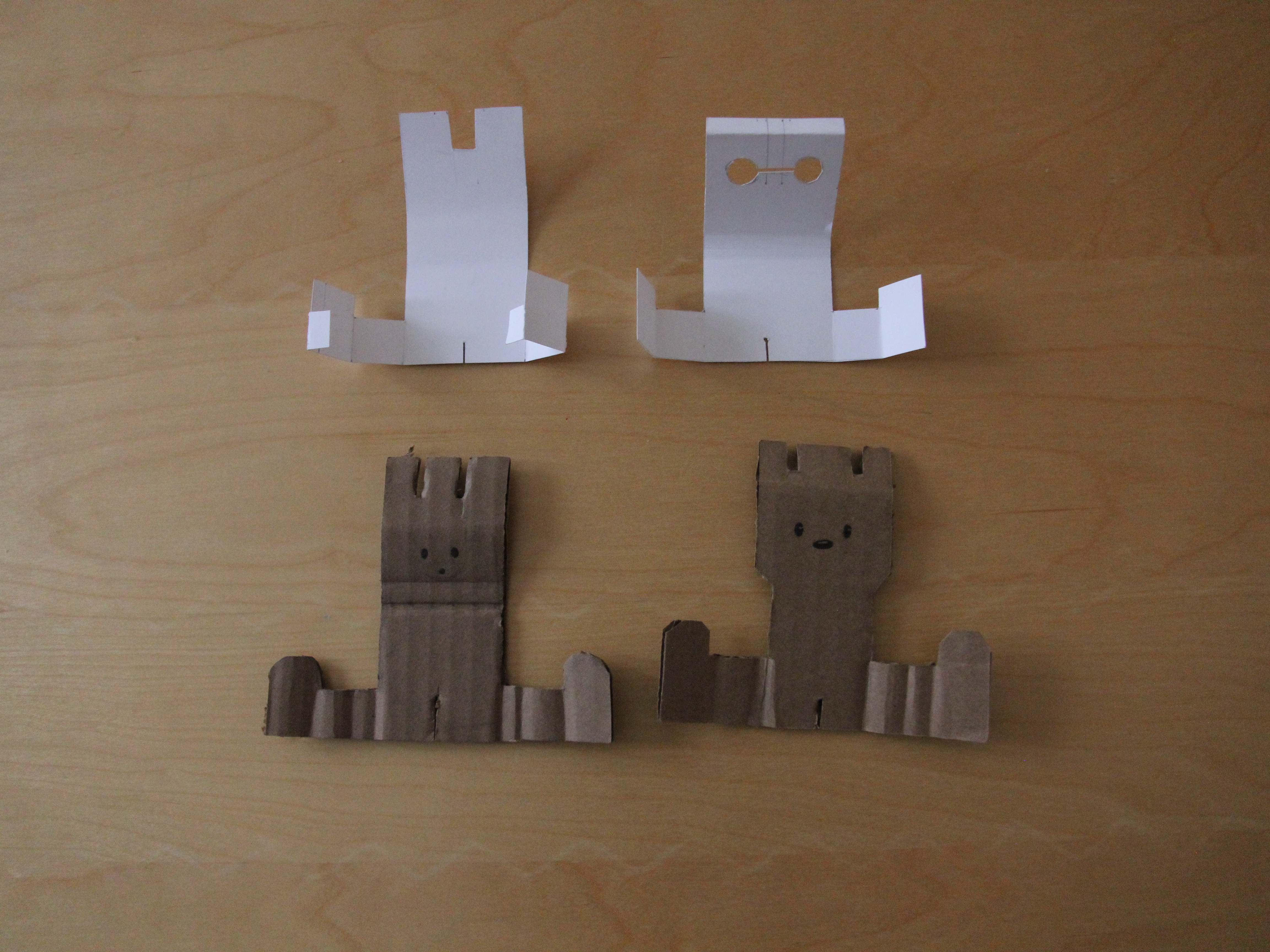
The first set of paper prototypes focused on exploring the different concepts along with locking mechanisms. Initial plans were for a single flat piece with ‘legs’ that could turn into a phone stand.
The idea of having a plushie for the earphones to wrap around was developed after seeing a plushie with a ribbon on it’s neck. Once this concept was discovered, the flat piece evolved to become a box and the ‘legs’ became a locking mechanism.
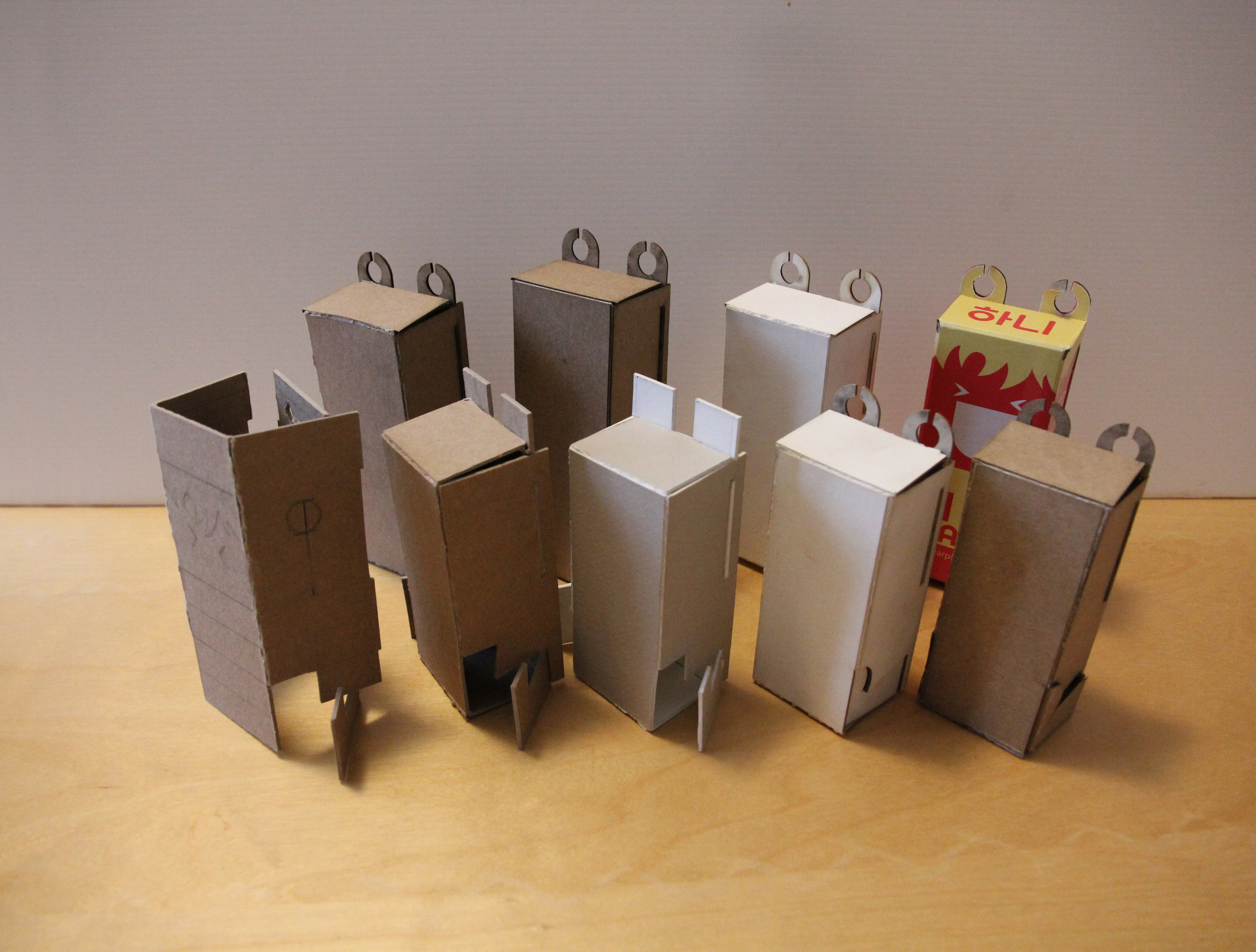
Requirements for the material were its sturdiness, lightness, and bendability. Three different thicknesses of illustration board were experimented with; a thick brown stock, a smoother white varient and a thinner, more flexible brown stock. The final package used P27 Illustration Board.
To attach the design, a sticker was printed and then pasted onto the material.
A critical aspect of the plushies were their thickness which affect how often the wires are wound. It also had to fit snuggly in the palm of one’s hand. The final width spanned three fingers.
The plushies were made by printing the design onto a transfer sheet, ironing the sheet onto a piece of cotton, sewn, and then stuffed. Everything was done by hand.